(You can scroll down to see the preliminary glyphs, with tentative labels !) Or click here
First: there are several words, which can be used to denote the little pictures in Phenomenalog. You can call them pictograms, symbols, hieroglyphs, icons, - or just "signs" or "glyphs".
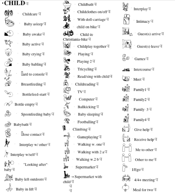
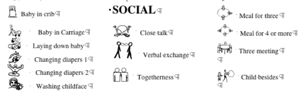
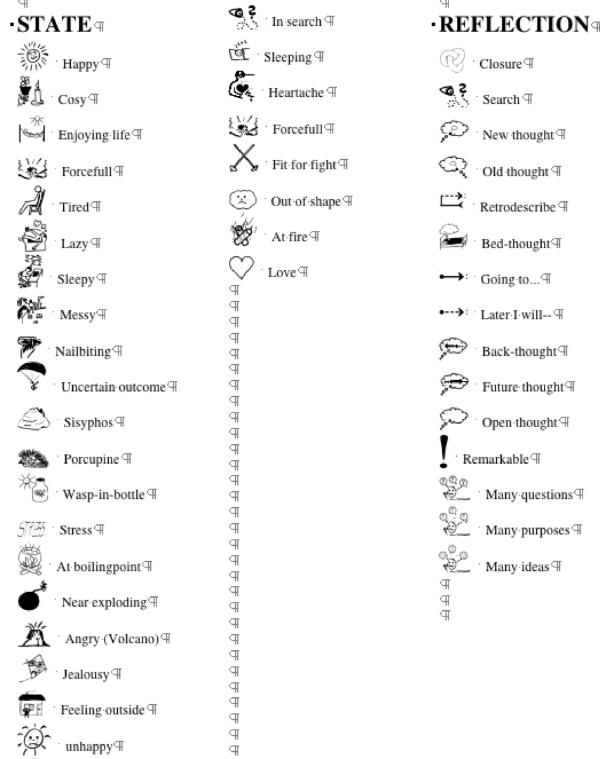
Their use here is mainly to refer to actions, although most of them actually depict objects. Such simplified pictures abound in contemporary culture e.g. in traffic signs, and especially in and around digital media - mostly in the form of so-called bit-mapped pictures, e.g. as smileys. Instead, they are in the diary technically transmitted as characters (letters) in 12 fonts, which means, that they each take no more storage capacity than a single letter. The approximately 450 pictograms (see below) going with this first public edition have grown out of the needs detected in the ten years use of early prototypes of the program, but hundreds more are evidently missing, and a lot of them would gain from qualified redrawing
A number of them have their origin in scandinavian symbols for the speech handicapped, but many have been drawn on the fly, by students and researcher. The policy has been not to strive for anything systematic: the more different. they could be, the greater the likelihood, that they will be easy to distinguish from each other, even in very small format. Bur it is evident, that they shall be as simple as possible, and in that respect many deserve upgrading.
They are distributed in 12 fonts. But the font categories and the allocation of icons in one or another of these is somewhat arbitrary, as is the sequencing in the icon-lists. To a systematic user, this may appear as unnecessarily confusing, (Part of the explication is their origin in one primary icon-font, created in 1994, and the desire to keep some backwards compatibility.)
But an important reason not to attempt a thorough systematization, before releasing the tool, is the hope of receiving feedback from several users, - with different cultural backgrounds, and different user purposes. Once such feedbacks are received in satisfactory amount, (see: "Help us to optimize the tool") some systematization, making it easier for users to find icons, they might find useful, shall be attempted.
However, we shall try not to eliminate icons, which have "a worthwhile idea", - even if such idea may not be recognizable by most users. This applies especially to icons depicting states of mind - for example the Sisyphus-icon,≠ the feeling outside icon, Æ the hedgehog icon¢ etc in the "state menu", and the closure icon A in the (all too limited) reflection menu.
It is our hope, that this kind of opening to the use of metaphorical icons, shall inspire future users to invent and construct more icons which may be of help to others to create the kind of intra-personal (= for oneself) accountability, which is demanded of persons, who strive to know themselves.
Beware: it applies to all glyphs that they have an (English) title, - but you are free to change their titles, in the lists, where you choose them (just hold down the alt-key, and click them). Your new title will follow new glyph-buttons, (as help text), but once they are produced, they will keep the title they had on the list in the production moment. But you can always erase them. !
The idea behind the use of pictograms in a diary, where the target-reader is the author her/himself, is not to make an objective classification, but to indicate and refer to embedded, contextualized subjective typicality’s. Two persons eating in the morning may be an uninteresting platitude to a third person, but significant to the diary-writer.
It is essential, that the user understands the freedoms available, concerning the use of the glyph buttons. That they can be given different colours, sizes, positions - and meanings (including that more versions of the same glyph can be placed at different places, with different colours and in different sizes!!! ) The design - and redesign - of the user-interface - based upon experimentation, trial and error, is thus a continued challenge, - and road to deeper insights into the nature of the personal lifespace.


--------------------------------------------------------------------------------------------------------------------
-------------------------------------------------------------------------------------------------------------------


-------------------------------------------------------------------------------------------------------------------


-------------------------------------------------------------------------------------------------------------------


-------------------------------------------------------------------------------------------------------------------


-------------------------------------------------------------------------------------------------------------------


-------------------------------------------------------------------------------------------------------------------

-------------------------------------------------------------------------------------------------------------------